

CTRL Logo & Marketing Collateral
In 2012, I rebranded the Center for Teaching, Research, and Learning at American University by creating a new logo and redesigning all the marketing collateral.
It was established that the colors for the logo had to be the AU blue and red, plus two of the Ann Ferren Conference logo colors, as this is one of the biggest events organized by CTRL. Also, the new logo had to tie into the AU logo.
Of the Ann Ferren Conference logo colors, I chose orange and green so they would form a tetradic color scheme with the red and blue. I chose a serif font with some quirk to it so it would still harmonize with Garamond (the typeface in the AU logo) but also have its own character and a more playful personality. I cropped the letters within the squares to make them more visually interesting and I didn’t center them to create some tension.
Below the mark is the whole name spelled out (some people may not know what CTRL stands for). This is set in Adobe Garamond Pro, per university guidelines.
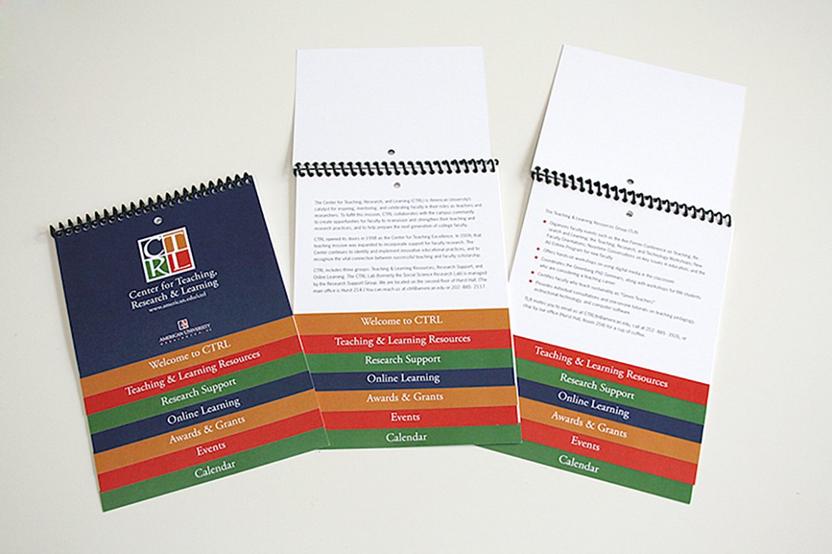
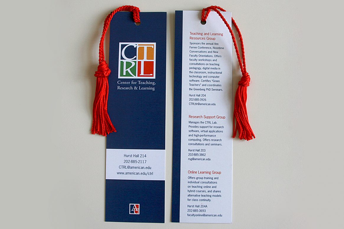
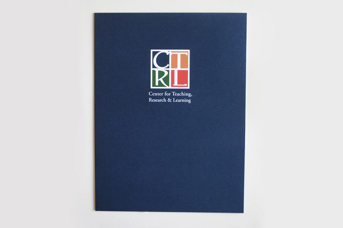
I also created a stepped booklet with tabs that follow the logo colors, a bookmark carrying information about the different CTRL departments on the back, and a pocket folder with the logo embossed on it.
PROJECT INFO.
- CLIENT: American University
- DATE RELEASED: 2012
- CATEGORIES: Logo design, graphic design
- TAGS: logo, bookmark, pocket folder, stepped booklet